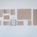
I lay everything on my carpet first with blue painter’s tape, starting with one big anchor piece slightly off-center.
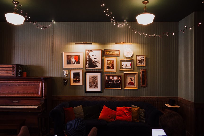
I keep my gallery wall about two-thirds the width of my sofa, with the bottom edge 6–10 inches above the back.
I space frames 1–2 inches apart, mix white, black, and natural wood frames, and let tops wander a little instead of lining up perfectly stiff.
This floor-planning trick prevents extra nail holes in your walls and eliminates installation mistakes.
Plan Your Layout on the Floor First
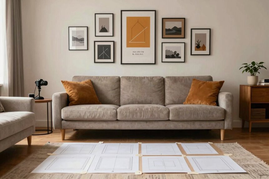
Ever stared at a blank wall and felt totally stuck? I’ve been there too. That’s why I always layout floor first when I’m planning a gallery wall. I grab blue painter’s tape and mark out the space on my carpet, usually about two-thirds of my sofa’s width. Then I slide frames around like puzzle pieces, no hammer required. I start with my biggest, boldest piece as the anchor. Everything else radiates outward from there. I keep fingers-width gaps, about one to two inches, between frames so nothing feels cramped. I use a loose horizontal line as my guide, then deliberately break it so the arrangement feels alive, not robotic. This floor rehearsal saves your walls from extra nail holes and gives you confidence before you commit.
Cover Two-Thirds of Your Wall for Perfect Proportion
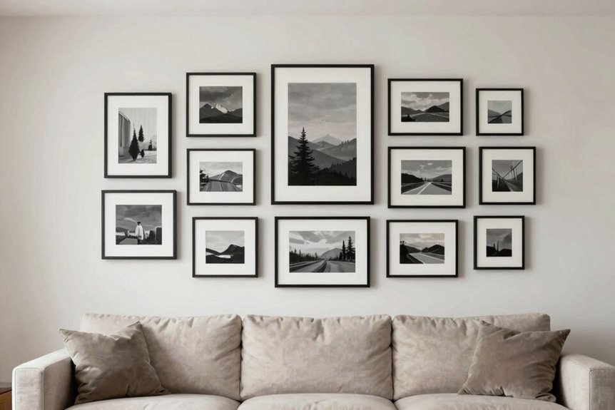
I like to aim for my gallery wall to span about two-thirds of my sofa’s width. This proportion creates visual balance and a professional appearance without looking cramped or floating. I measure my sofa first, then mark out that two-thirds zone on the wall with painter’s tape so I can see the boundaries clearly before hammering any nails. Mixing frame sizes keeps things interesting, but I make sure no single piece overwhelms the others. Think of it like arranging a band where every instrument gets heard without the drums drowning out the guitar.
Optimal Sofa Coverage Ratio
How do you know when your gallery wall looks “off” but you can’t pinpoint why? Staring at your sofa coverage and wondering why it feels floaty or cramped has a solution: the two-thirds width ratio.
Here’s what works every time:
- Measure your sofa first, then multiply by 0.66 for ideal gallery wall width
- Keep that bottom edge 6–10 inches above your sofa back so everything feels connected
- Mark 57–60 inches up your wall, where eyes naturally land
- Start hanging from the center with 1–2 inch gaps between frames
For an 84-inch couch, aim for 56 inches of art. A 60-inch loveseat works best with forty inches. These numbers deliver proportional results consistently.
Measuring Wall Space Correctly
Precision saves us from the “something’s wrong here” headache that haunts so many gallery walls. This is how I measure mine.
First, I grab my tape measure and check the sofa width—let’s say it’s 72 inches. For that sweet spot, I target Two-Thirds Width, which lands me around 48 inches. No math stress; just sofa width divided by three, times two.
Next comes Eye Level Alignment. I mark 57 to 60 inches from the floor, where our eyes naturally rest when we’re standing and chatting. The bottom edge hovers 6 to 10 inches above the sofa back, so everything feels connected, not floating.
| Step | Action | Target |
|---|---|---|
| 1 | Measure sofa width | Full inches |
| 2 | Calculate Two-Thirds Width | Sofa width × 0.67 |
| 3 | Mark Eye Level Alignment | 57–60 inches from floor |
I keep 1–2 inches between frames. This spacing prevents crowding and maintains visual balance.
Balancing Frame Scale Proportion
With my measurements marked on the wall, I’m ready to figure out which frames go where. I want my gallery to feel like home, not a museum.
- I aim for two-thirds of my sofa’s width, so a 72-inch couch gets a 48-inch wide arrangement.
- I keep the center at 57–60 inches high, right at eye level where we actually look.
- I place my biggest piece first, usually off-center, then build around it like a puzzle.
- I mix horizontal and vertical frames, pairing a tall skinny one with a wide landscape for visual rhythm.
I space frames 1–2 inches apart and 4–6 inches from the edges. I avoid perfect lines; slight height variations feel collected, not chaotic. This balance creates an intentional and welcoming wall.
Choose Colors That Tie Your Art to Your Sofa
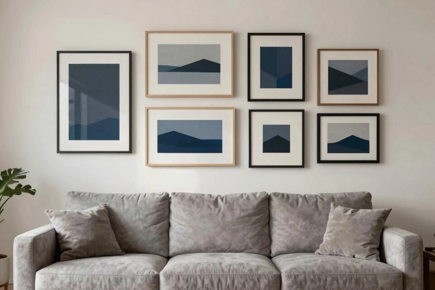
I start every gallery wall by picking a tight palette, usually three colors max, and making sure one of them coordinates with my sofa. If your couch has warm caramel undertones, I’ll hunt for art with honey or rust accents; cool gray upholstery calls for slate blues and silvery greens. I’ll carry those same tones through frames, mats, and even a throw pillow, so the whole wall feels cohesive with the sofa rather than clashing with it.
Picking Your Palette
Why does staring at fifty paint swatches feel like trying to pick a favorite star in the sky? I’ve been there, frozen in the paint aisle. Your color palette doesn’t need to be perfect; it needs to be yours.
I start by choosing three anchor colors, maybe pink, blue, and yellow, and repeat them across my wall art. This instantly ties everything together without matching too hard. For my vintage gallery, I lean into neutral tones, blues, and golds with white or natural wood frames. Designers like Emily Henderson swear by this approach.
Here’s how I keep it cohesive:
- Pick three anchor colors and repeat them
- Use consistent frame tones, white or wood works
- Vary sizes and formats, not hues
- Snap a layout photo before hanging
Your wall will feel intentional, not cluttered.
Matching Sofa Undertones
Once I’ve nailed down my three anchor colors, I look straight at my sofa and identify its undertones. That navy couch contains hidden teal threads. My camel velvet has warm caramel underneath.
I build my color palette around these undertones. If my sofa reads cool, I pull in blues and silvers. Warm undertones mean I reach for golds and soft pinks. The key is keeping everything similar in tone and intensity, so nothing stands out.
I stick with white or natural wood frames to tie diverse pieces together without competing. These frames let varied prints and canvases work as one cohesive group. Your art and sofa will feel intentionally coordinated rather than mismatched.
Unifying Art Colors
How do I make six random posters look like they actually belong together? Color harmony is the secret glue for any gallery wall.
Here’s my foolproof method:
- Pick 2-3 anchor colors from your sofa, maybe dusty pink, navy, or butter yellow, and repeat them across every piece.
- Keep tones similar in intensity. Mix saturated brights with muddy neutrals and everything feels off.
- Tie your frames to the room with white and natural wood to anchor calm when your art gets wild.
- Pull one hue from your rug or curtains into a frame so your eye travels peacefully.
I snap a floor-plan photo first, marking nail spots with paper templates so my color-coordinated placements stay intentional. Your mismatched treasures will feel cohesive as a unified collection.
Anchor Your Gallery Wall With One Big Piece
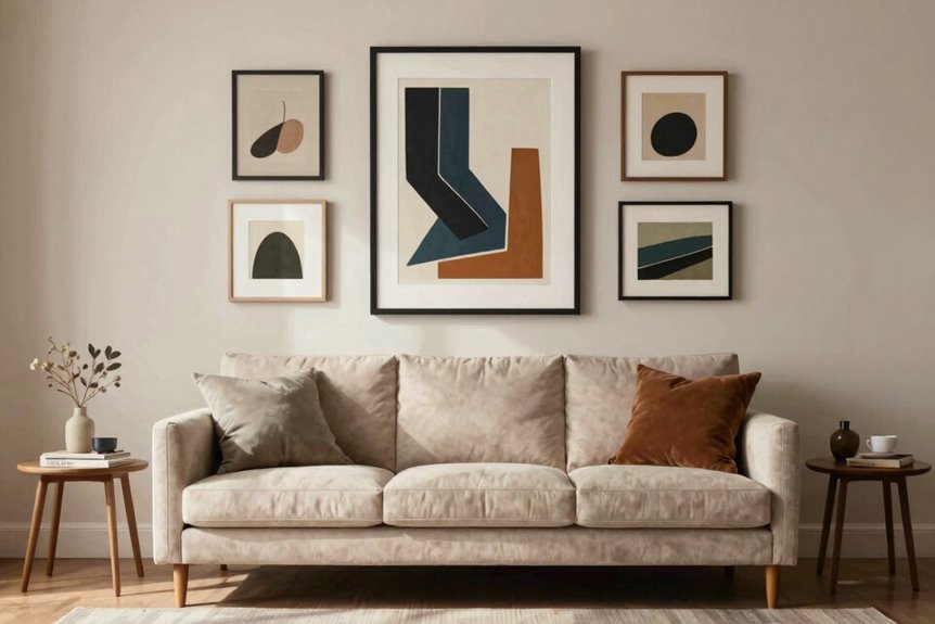
Where do you even start with a gallery wall? Grab your biggest piece first as your anchor piece and place it in an outer corner or slightly off-center. Don’t center it perfectly; that creates flow and feels more intentional.
Your total gallery width should sit around two-thirds of your sofa for balance. Lay everything out on the floor first, starting left and working right with roughly two inches between frames. That spacing keeps the rhythm steady without looking cramped.
Pick a focal picture that makes you smile, something personal, and build outward from there. Use painter’s tape to mark temporary spots before hammering any nails. You’ll shift things a few times, and that’s completely normal. The process works when you let it develop naturally.
Mix Horizontal, Vertical, and Round Shapes
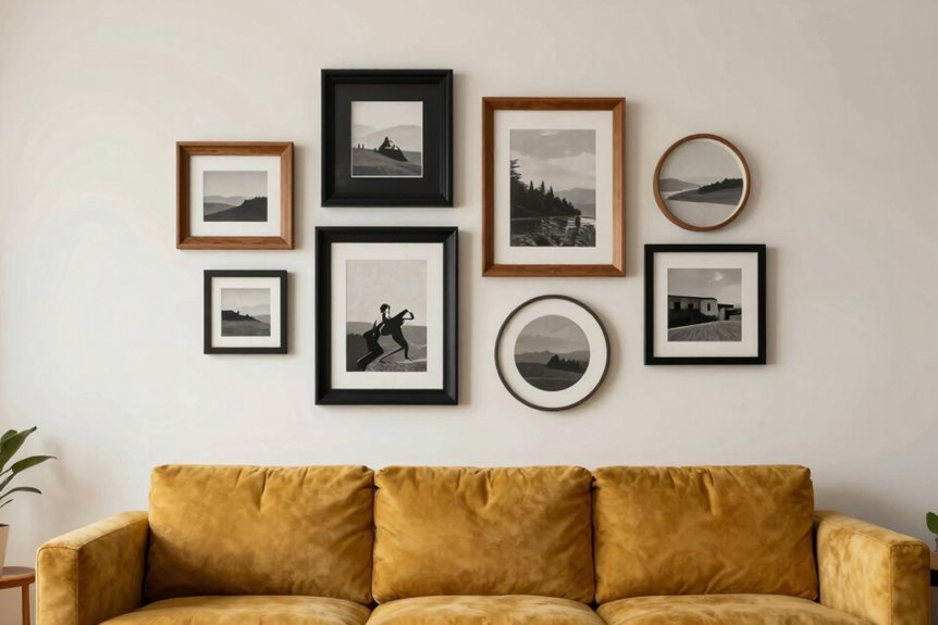
You’ve got your anchor piece locked in, but now the wall needs some life. Mix horizontal, vertical, and round shapes to wake up your gallery and keep eyes dancing across the space.
To build rhythm without chaos:
- Start with your anchor, then radiate outward with pieces turned every which way
- Cluster in grids of 2, 3, or 4, but break the line with a tall vertical or wide horizontal
- Pair chunky frames with lighter neighbors so nothing feels lopsided
- Keep gaps tight, about 1 to 2 inches, and let tops wander instead of marching in formation
A round mirror tucked in the center softens all those edges and pulls the whole wall together. Your gallery should feel collected, not cataloged.
Combine Three Frame Styles Without Chaos
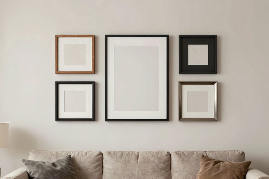
Why stop at one frame style when three can look even better? I start with clean white, black, and natural wood frames as my foundation. This trio gives my gallery wall visual variety without tipping into chaos.
I alternate these frame styles like a pattern, then sprinkle in ornate accents if the mood strikes. A varied collection actually prevents messiness, especially in bigger spaces where too much sameness feels flat.
I center one bold piece as my anchor, then flank it with complementary frames. I keep the bottom edges roughly aligned but let the top edges breathe; strict symmetry feels stiff. My secret is consistent one-to-two-inch gaps between everything. I map it left-to-right on the floor first, or use painter’s tape on the wall. Testing saves me from nail holes I don’t want.
Add Personal Items Beyond Traditional Art
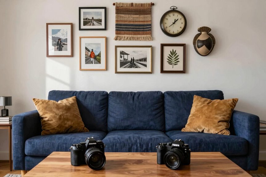
I love weaving in personal mementos like my grandmother’s handwritten recipe or a pressed flower from a hike, and I balance these with found objects such as a rusted key or a smooth river stone to add unexpected texture. I keep my gallery fresh by rotating meaningful pieces every few months, swapping in new Polaroids printed from my Canon Ivy for instant, cohesive updates. I test arrangements on the floor first, spacing frames about two inches apart and avoiding rigid top lines so the wall feels collected rather than staged.
Mix Personal Mementos
What makes a gallery wall truly yours? The personal items and mementos you weave between the frames create that distinction.
Start with a focal piece, then build outward with roughly 3 inches between each item. Mixing textures keeps it from feeling like a store display.
Treasures worth framing:
- A friend’s sketch
- Faded family Polaroids
- A cocktail napkin from that night
- Keepsakes with stories attached
Plan everything on the floor first, taping out your sofa’s width. Digital prints beside mementos create warmth without chaos. Stick to a shared color palette so it all belongs together. Your wall becomes a story only you can tell.
Include Found Objects
Personal mementos tell your story, but don’t stop at framed photos. Tuck found objects into your sofa gallery wall: things that spark “Remember when?” moments. A cocktail napkin from your first date, your baby’s ultrasound, handwritten vows. These tangible keepsakes add texture no print can match. Mix digital art with these treasures, surrounding a central piece to anchor the eye.
Gallery wall spacing matters here. Lay everything on the floor first, testing arrangements. Keep gaps tight, about one to two inches, so found objects feel woven together rather than scattered. Balance a fabric banner or small mirror against framed pieces to break sameness. Your wall becomes a scrapbook of belonging, collected rather than catalog-like.
Rotate Meaningful Pieces
While your gallery wall might look finished today, it shouldn’t stay frozen in time. I personalize mine by rotating meaningful pieces that tell our evolving story. I’ll swap a summer Polaroid for a friend’s sketch, or tuck my grandmother’s recipe card beside a watercolor. This keeps the wall breathing and authentic.
To diversify beyond traditional frames, I mix these treasures in:
- A child’s drawing in a slim black frame
- Vintage family photos in brass clips
- A pressed cocktail napkin from a memorable night
- Small keepsakes mounted on floating shelves
I stick to cohesive colors; soft blues, warm neutrals, glints of gold. Even quirky items feel connected. Your gallery wall becomes a living scrapbook, not a static museum piece. When you rotate pieces regularly, your space reflects who you are now, not who you were months ago.
Space Pieces 2–4 Inches Apart and Plan for Growth
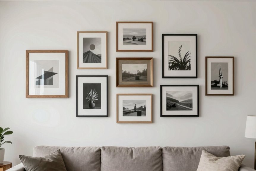
How do I keep my gallery wall from looking like a chaotic mess? I nail the spacing. Roughly 2 inches apart, horizontally and vertically, keeps everything cohesive but breathable, like a friendly conversation rather than a shouting match.
Before I hammer a single nail, I lay everything on the floor. I start left, work right, and identify one focal picture to anchor the whole thing. Then I arrange surrounding frames around it, leaving temporary gaps to eyeball the balance. The spacing isn’t rigid; I’ll nudge frames until the flow feels right.
I use a horizontal alignment as my baseline, then break straight lines with varied placements for energy. This way, my gallery wall grows naturally. I’ve left room to add that vacation photo I’ll definitely take next summer.
Adjust Your Layout to Your Specific Sofa Style
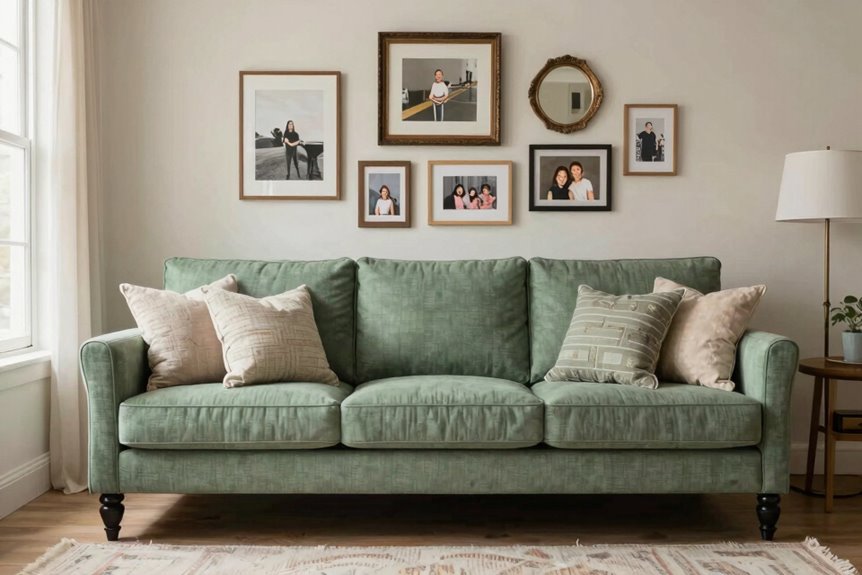
Why squeeze a giant gallery wall behind a tiny loveseat or skimp on a sprawling sectional? Match your arrangement to your sofa footprint: tight rows for dainty pieces, elongated spreads or L-shaped clusters for sectionals that devour wall space.
- Measure twice. Aim for a composition about 56 inches wide on an 84-inch sofa, roughly a 3×3 grid, keeping the bottom edge 6 to 8 inches above the back.
- Center your anchor. Place one bold frame style as your focal point and build outward evenly.
- Break the line. Use horizontal alignment as your base, then offset frames for visual rhythm.
- Test on the floor. Lay everything out first, checking gaps with painter’s tape before committing.
Hang Your Gallery Wall Without Drilling Holes
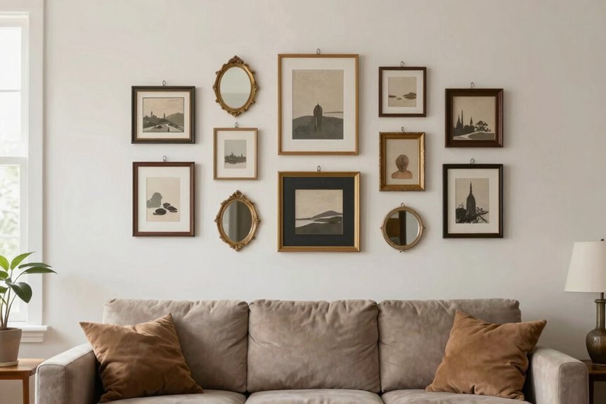
You’ve mapped out the perfect arrangement for your sofa style, and now your fingers are itching to get those frames up without worrying about security deposit deductions. Nobody wants to patch drywall later.
Tape a box on your floor to mimic the wall space, then shuffle frames inside until the arrangement feels balanced. Keep about two inches between pieces; tight enough to feel connected, loose enough to breathe.
| Step | Action | Pro Tip |
|---|---|---|
| 1 | Choose your star piece | Pick one frame that makes your heart sing |
| 2 | Build around it | Add supporting frames like friends gathering round |
| 3 | Stick, don’t drill | Use Command strips or restickable tiles |
Align along the bottom edge, letting tops wander naturally. That’s where visual interest emerges. Test, peel, and reposition as needed. Your gallery wall will reflect your personal style rather than look like a formal museum display.
Extend Your Gallery Wall With Shelves or Mirrors
Want to expand your gallery wall without adding more holes. Shelves and mirrors work effectively for expanding your display while keeping things flexible.
Mirrors create visual impact. Center a round or arch mirror above your sofa, then flank it with two narrow columns of Mixtiles. The reflection bounces light around your living room and increases the perceived space.
To layer without permanent commitment:
- Install a slim picture ledge 8 to 10 inches above your sofa
- Lean three to five tiles casually for easy swapping
- Pair mirrors with ledges to reflect depth and extend the wall
- Test your layout on the floor first, spacing pieces roughly 2 inches apart
Your gallery will feel bigger and brighter.
Avoid These 6 Common Gallery Wall Mistakes
Once you’ve arranged your gallery wall with shelves or mirrors, it’s tempting to step back and call it finished. Rushing, however, leads to rookie errors.
Rushing to finish your gallery wall leads to rookie errors you could easily avoid.
First, don’t cram your frames together like subway passengers. Your spacing needs breathing room. Keep gaps between one and two inches. Anything tighter feels claustrophobic; anything looser looks accidental.
Perfect horizontal lines create a stiff, corporate vibe. Embrace asymmetry instead. It feels more like home.
Mix your frames in white, black, and natural wood together to prevent that chaotic jumble. Start with your largest piece as your anchor, then build outward. Don’t cover every inch of wall behind your sofa. Stop at two-thirds full. Your eyes need rest, and so does your gallery wall.